

The website of the institute I interned for needed an update. It wasn’t mobile responsive and it wasn’t meeting university brand standards, among other issues. From a content perspective, it was designed for an internal audience already familiar with the institute’s projects and focus areas.
A meeting with the communications director and associate director of the institute resulted in the decision that the “old” CREATE for STEM site should remain for the aforementioned internal audience while a new site should be designed to reach out to a wider audience – K-12 STEM teachers, parents of K-12 students, policymakers, journalists, and others.
As a content strategist with skills in Drupal, I got to work creating a “prototype” site that would illustrate the type of theming and information architecture that would fit a wide, general audience.
I began with some wireframes to sketch out my ideas.
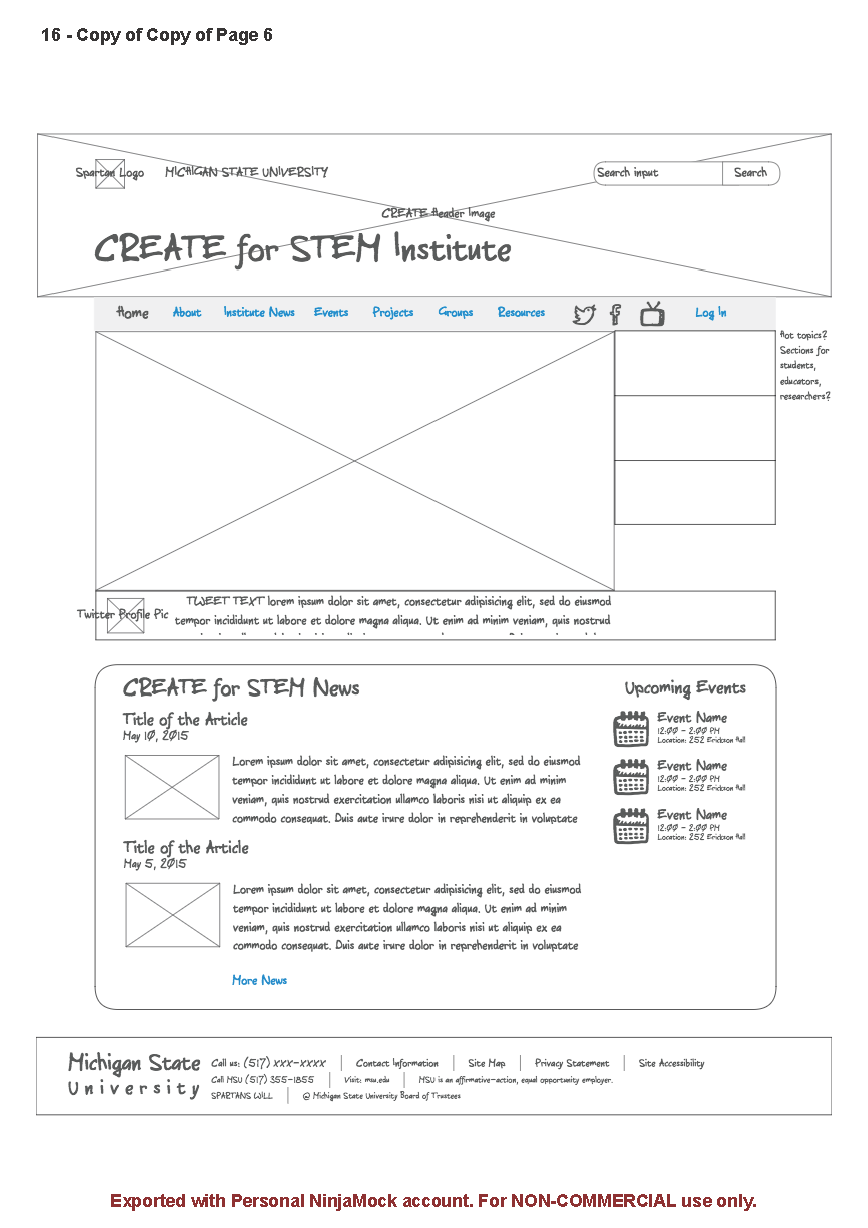
Homepage
I ensured that the header and footer both met the MSU brand standards.
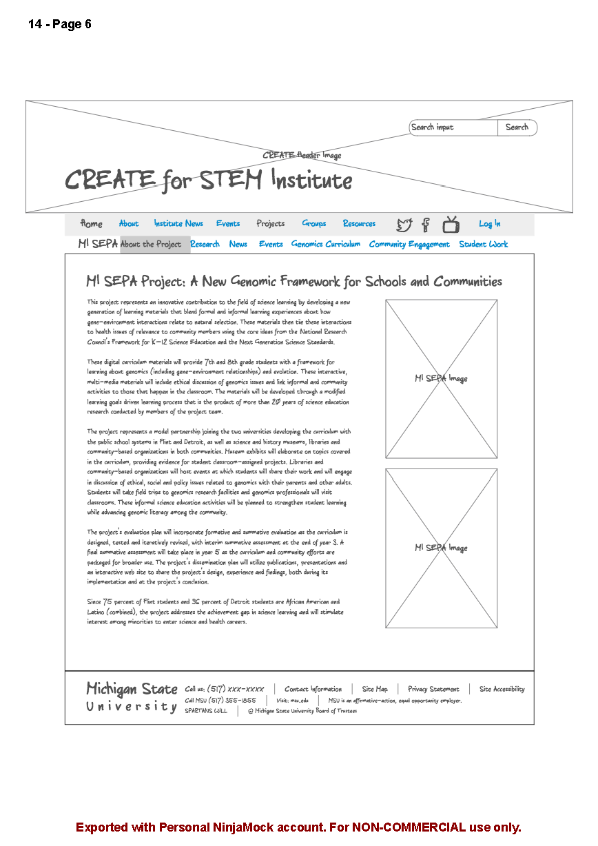
Project page (horizontal navigation)
I imagined that clicking one of our projects could open up a second horizontal menu to go below the main navigation. Visitors would be presented with a brief description of the project in language as jargon-free as possible.
Project page (vertical navigation)
In this arrangement, the project-specific navigation appears in a sidebar parallel to the main content. A “Quick Facts” box makes it easy to find information such as the project’s timeline or funding source.

Eventually I was given access to a domain where I could freely develop and test a new site. I began with a fresh install of Drupal, since that’s the content management system used by the current (or “old”) CREATE for STEM website.
I purchased a theme that inspired me as a designer and got to work heavily modifying it through HTML, CSS, the occasional PHP, and a bevy of Drupal modules. Here’s how it stands, as of its last update [November 29, 2015]:
Homepage
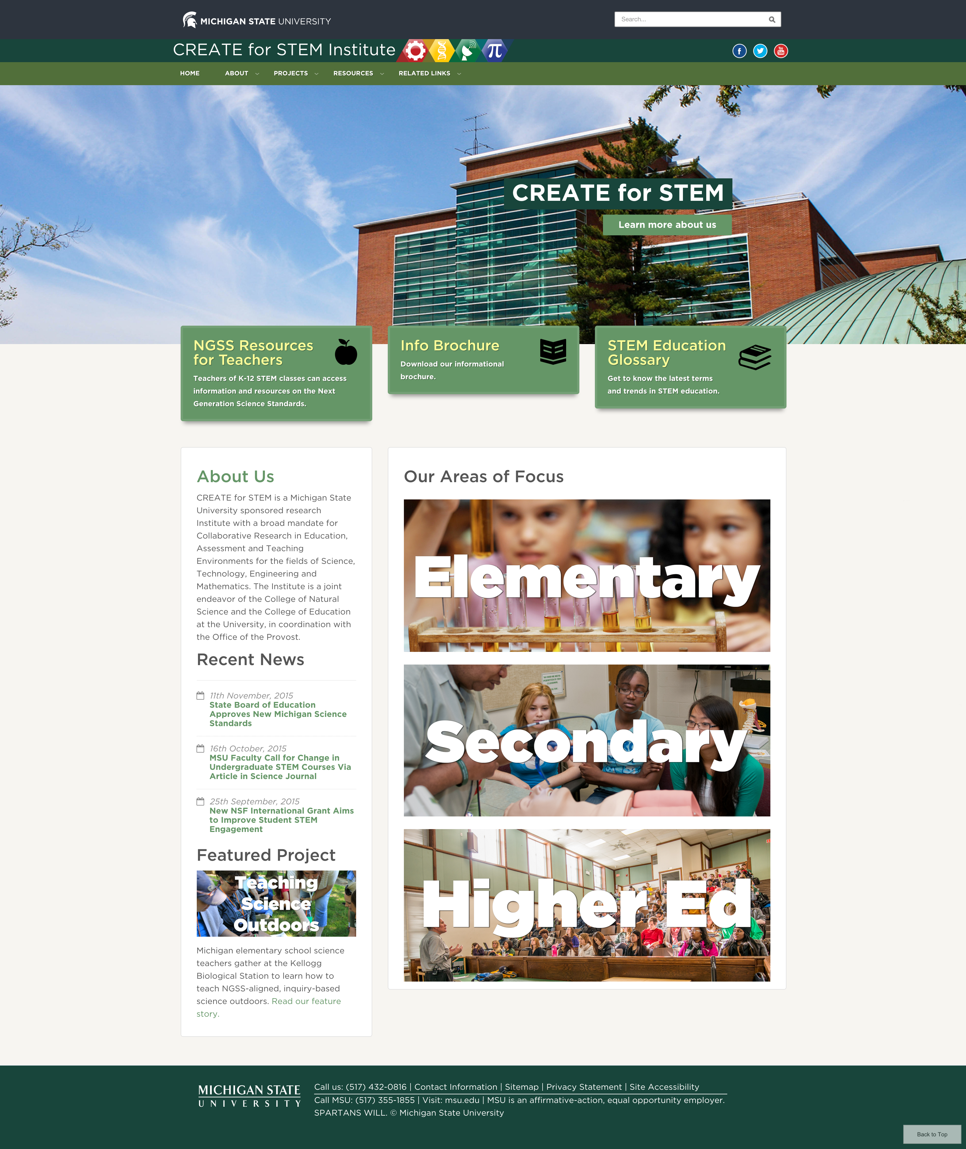
I opted for a static image at the top of the screen as opposed to a slider (or “carousel”), since sliders almost always do poorly in usability testing. (The website “Should I Use A Carousel?” illustrates this point hilariously.)
Three boxes aligned horizontally below the banner image highlight some of the resources currently housed online by CREATE for STEM. There was talk of having these read “For Teachers,” “For Parents,” “For Policymakers” – or something along those lines – and it’s possible that in the coming weeks, they will be modified.
The sixteen projects currently underway at CREATE for STEM are divided into three areas of focus (Elementary, Secondary, Higher Ed), which can be explored in greater detail by either clicking the respective images or the “Projects” tab in the top navigation bar.
Project page

I ended up going with the sidebar layout for the project pages. Of course, this is subject to change. There’s some debate at the moment over what content actually belongs in the sidebar.
You can visit the site at http://104.131.113.207/. [Update 8/31/17: Unfortunately, it looks like the site is no longer live.] My internship with CREATE for STEM has been completed, so it is unlikely that this site will be developed further, but it stands as my favorite web design I’ve created.
 Josh Anderson
Leave a comment