

An early task in my Website Analysis and Content Internship at Michigan State University’s Department of Student Affairs & Services was to conduct a landscape analysis on the websites of all the other Big 10 schools’ equivalents to our department. This was a first step in planning a broad redesign of our site.
I pulled up blank Google Doc in one tab of my browser and cycled through the Big 10 universities’ sites in another tab, taking notes on what I found. I then took screenshots of each site and organized my thoughts into a Google Slides presentation, sharing the online document with my boss. My tone was informal, and I encouraged my boss to add his thoughts to my document.
Each Big 10 school had their Student Affairs (or equivalent) website graded based on eight heuristics:
Responsive design
Is the site mobile-friendly? Does it adapt nicely to differently sized browser windows?
Aesthetic appeal
Is the site pleasing to the eye? Does it make good use of the school’s colors? Is there an appropriate amount of text onscreen? Are obnoxious javascript effects getting in the way of a fluid experience?
Does it appear to be updated regularly?
How do I know if I can trust the site if it doesn’t contain any recent news or timely information?
Is it easy to find information on campus housing?
This and the next question grade the findability of expected components of any Student Affairs website.
Is it easy to find information on counseling services?
This could literally be a life-or-death matter for some people – there’s no excuse to mess this up!
Is there a clear social media presence?
Can I easily find links to the social media accounts of the department? Better yet – are those accounts integrated into the page somehow? A Twitter feed? A Flickr slideshow?
Is there information on the Vice President?
Student Affairs departments are almost always the realm of a university’s Vice President. I might not expect him or her to be pictured on the homepage, but I should sure find something about the Vice President on an “About” page.
Is there an appropriate number of links onscreen?
How’s the navigation? Are links to other departments under the Student Affairs umbrella organized logically and effectively? Are they hidden under unwieldy dropdown menus? Is the homepage an ugly barrage of hyperlinks?
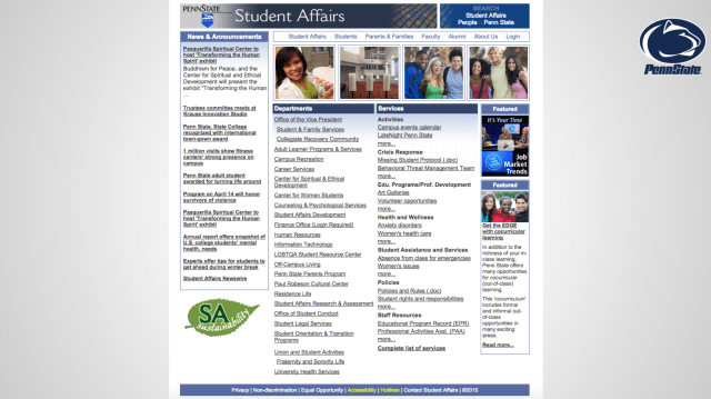
Each heuristic was given a score from one through five, with five being the best. I totaled the scores and found that the most well-made Student Affairs site in the Big 10 was… well, you’ll have to view the full analysis to find out.

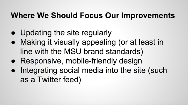
I also found the mean of the scores in each category and compared those averages to MSU’s performance. With that side-by-side analysis, I came up with a list of recommendations for what we should focus our efforts on.
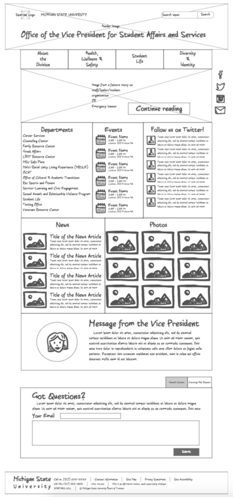
This landscape analysis culminated in my creating a wireframe for a new MSU Student Affairs site. Everything from the navigation text to the arrangement of the content types was informed by my analysis.

Leave a comment