
Donald Trump’s mug shot is a political Rorschach test. Does it depict the scowl of a criminal, finally humbled after decades of egregious wrongdoing? Or does it show the steeled glare of an innocent man, unfairly targeted by a corrupt, partisan justice system?

Regardless of how you or I feel about it, both pro-Trump and anti-Trump products that use the mug shot photo have emerged on the marketplace. I find it interesting that the exact same image can inflame the passions (and loosen the purse strings) of both sides.
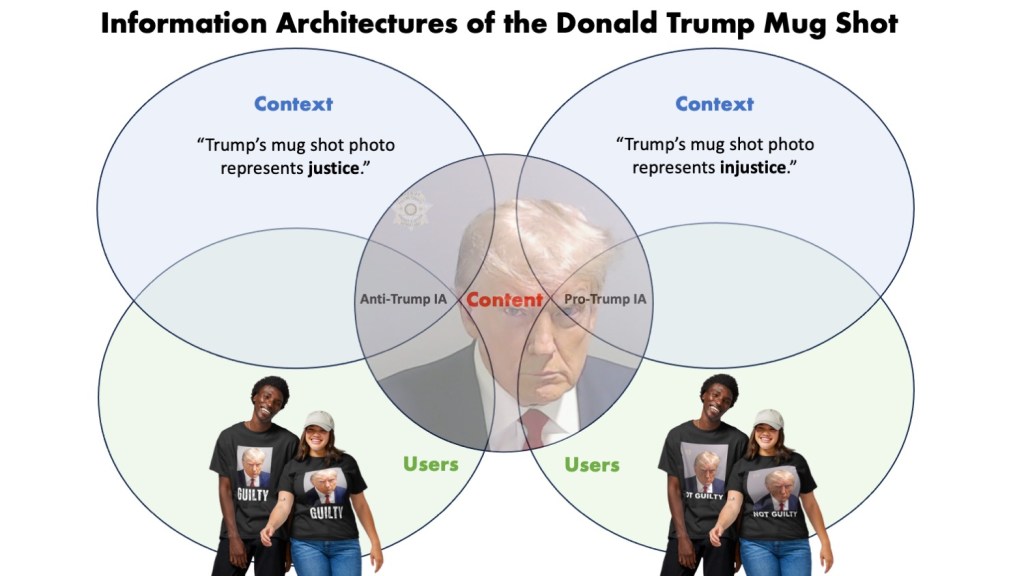
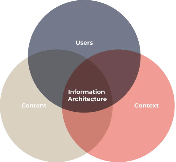
Information architecture gives us the tools to figure out what’s going on. We need not look any further than Peter Morville and Louis Rosenfeld’s “three circles of information architecture”: Context, Content, and Users. Information architecture is that which arises from the confluence of these three elements.
IA Influences a Sense of Place
Cues in our environment constantly imbue us with a “sense of place.” This is true in nature: if we hear waves crashing and feel sand beneath our feet, we know we’re at the ocean – a place for swimming, for example. This is true in the built environment: environments where many seats are clustered and facing one another imply that such places are for discussion. (The architect Christopher Alexander developed a “pattern language” around these sorts of things.) We also get a “sense of place” when we navigate websites and applications: if we notice navigation labels conforming to a recognized archetype, such as “TV Shows,” “Movies,” “Originals,” etc., we can likely correctly guess that we are at a place for watching videos. This is distinct from a place to meet friends (a social media site), or a place to withdraw money (a bank website), etc. Conforming to these patterns allows designers to create digital environments that are familiar and welcoming to users.
In addition to natural, built, and digital environments, this “sense of place” can manifest in more abstract ways as well. We can feel like we’re living through a bad point in history, such as a “time of war.” We can feel a sense of place along a social hierarchy. We can feel like we are “in” or “out” of the good graces of another. We can feel “on top of” or “buried under” our work.
Information architects intentionally bring about the confluence of users, content, and context to elicit a sense of place. That sense of place can be anything from, “I feel safe here,” to “I’m at the bottom of the social hierarchy for now, but not if I buy this product.”
Products that design around the Trump mug shot manipulate context in order to target different audiences. The sense of place these products create is a perception of the United States, as influenced by the criminal justice system’s treatment of Donald Trump. Americans see the mug shot and ask themselves, “Do I live in a just or unjust country?”
Designing Context

So how can information architectures actually “design context”? In his book Understanding Context, information architect Andrew Hinton identifies the three materials we need:
- Labels
- Relationships
- Rules
Labels
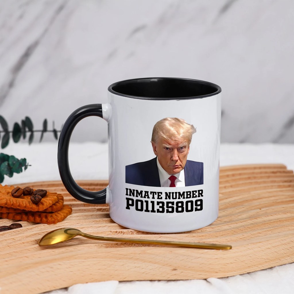
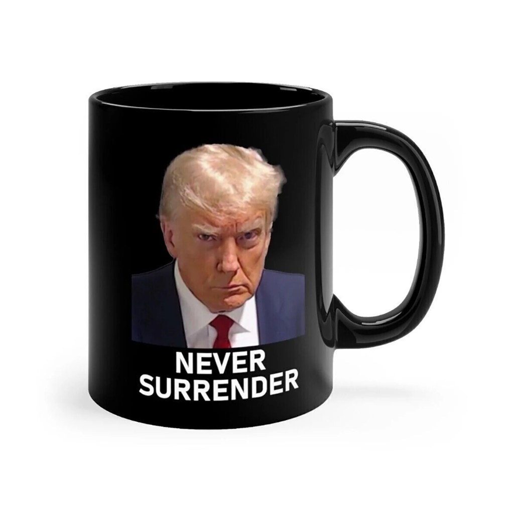
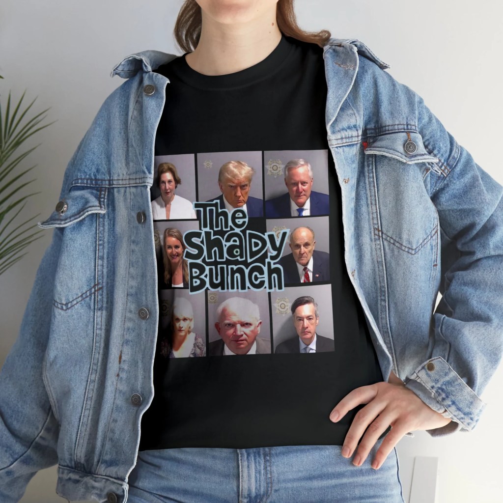
A simple “Guilty” or “Not Guilty” attached to Trump’s mug shot makes it obvious what the intended message is. “Never Surrender” is a popular pro-Trump label, while a mock inmate number is a popular anti-Trump label. Other phrases can be more suggestive. If, for example, the mug shot is on a shirt next to “Truth Will Triumph,” it’s not immediately obvious what the wearer sees as “truth.” Is the truth that Trump is innocent or guilty? Consumers might prefer ambiguous labels if they enjoy raising eyebrows and trolling.
Relationships
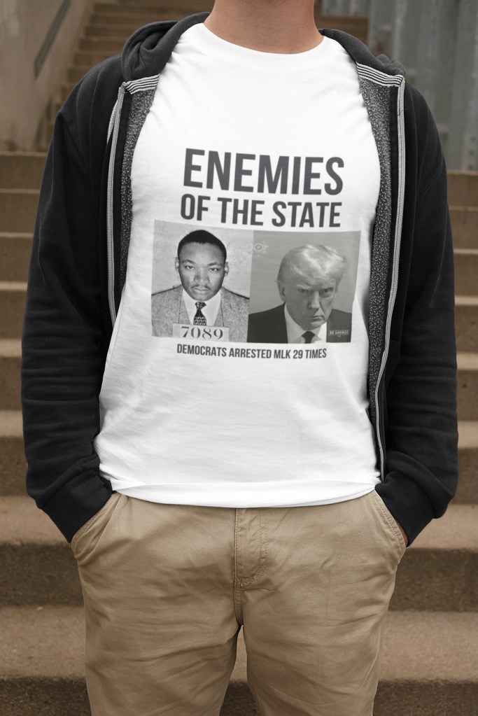
Is this Trump’s Al Capone moment, or his MLK Jr. moment? We only understand anything in relation to something else. The mug shot’s placement besides another image immediately adds context and changes the significance of the photo (not to mention the intensity of the response it will elicit).
Rules

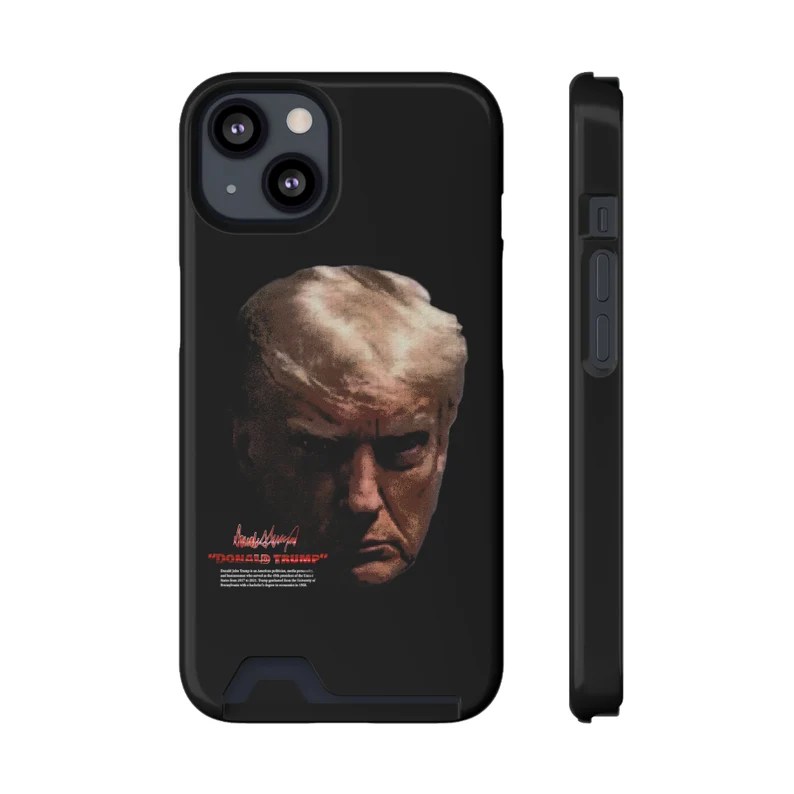
This one is a little more abstract. The comparable step in Dan Klyn’s IA model would be “choreography.” It’s how the parts interact; how you as the user interact with the product. I think another appropriate name might be “affordances.” Ask yourself, what is it about the very nature of the product that lends itself to a particular use for it? If it’s a roll of toilet paper, it’s meant to be disrespected. But what if it’s a phone case, meant to hold close, to be seen by others, to trust with the safety of your valuable device?
Is it possible to make a product using this mug shot that’s truly neutral? I think we can come close. There are plenty of T-shirts that carry nothing other than the image. What messages do those send? I suppose it would depend on the environment in which they are worn. The person wearing such a T-shirt might find themselves profiled. (“That person looks like they’re for/against Trump.”) These ambiguous products theoretically appeal to the widest possible audience since they don’t explicitly exclude any audience. But the mug shot standing alone is lost adrift vast semantic space. Unmoored by any obvious context clues, these products risk misinterpretation.
Designing Understanding
What’s the takeaway from this? Well, if you want to exploit an iconic, inherently controversial image for Etsy store purposes, this post might provide you with ideas for how to squeeze out profit, appealing to all possible audiences by exploiting every angle of interpretation. Outside of that, perhaps this draws your attention to the different vantage points from which to decode the intent behind content embedded in context. Of course, you know what they say about assuming 😏. What might seem to us as the most glaringly obvious context clue can tempt us into leaping to inaccurate conclusions about other people. The vantage points of labels, relationships, and rules are only some of the ways for us to grasp at meaning in the face of limitless information.
