
Recently I discovered an incredible mix from the electronic artist Nitepunk; it’s a recording of a live show at DEF in Atlanta, GA. Nitepunk strings together relentless, heavy dubstep and drum ‘n’ bass tracks for an hour. It’s honestly inspiring me to want to get back into DJing.
Thanks to its incredibly talented userbase, I find Soundcloud to be a gold mine for discovering pre-mainstream tracks and mixes like this. There are thousands of unknown, unappreciated Soundcloud pages filled with tracks that hit as heavy as anything the festival DJs can cook up. I discovered Nitepunk’s mix on Soundcloud, so this was my “view” of the track:
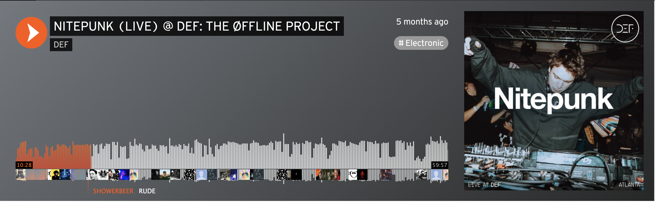
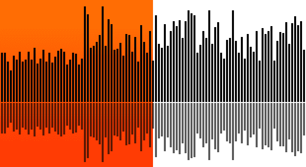
Soundcloud presents a waveform of the track. I can easily navigate to any point of the song by clicking there. The higher each bar of the waveform reaches, the louder that point in the track. At a glance, I can see the overall energy of the mix; this UI places me atop a mountain, allowing me to survey the kinetic peaks and valleys of the audio content. I can skip ahead to the drops to assess if several minutes of musical build up will be worth my time.
In the case of this mix… it was. “RUDE” was the only comment I could muster at one particularly stanky moment. My and others’ comments provide a folksonomic navigational axis for this track; presumably the places where comments cluster are the most noteworthy. Commenters’ words, however, are hidden until hovered over individually.
For some types of music, where its unpredictability is part of its appeal, this type of visual guide to the audio might actually be a sort of spoiler. (I believe there used to be an option for Soundcloud creators to substitute their waveforms out for generic shapes that abstain from clueing in the listener as to what comes next, but I can’t find this option when I try to edit any of my own tracks.)
YouTube also has its own version of Nitepunk’s DEF mix. Unbeknownst to me, the whole thing was filmed in addition to being recorded! 😳 By holding my cursor over the red video progress bar at the bottom of the screen, a waveform visualization of this track distinct from Soundcloud’s presents itself. Unlike Soundcloud’s waveform, which shows volume, this waveform shows which points of the video were the “most replayed.”
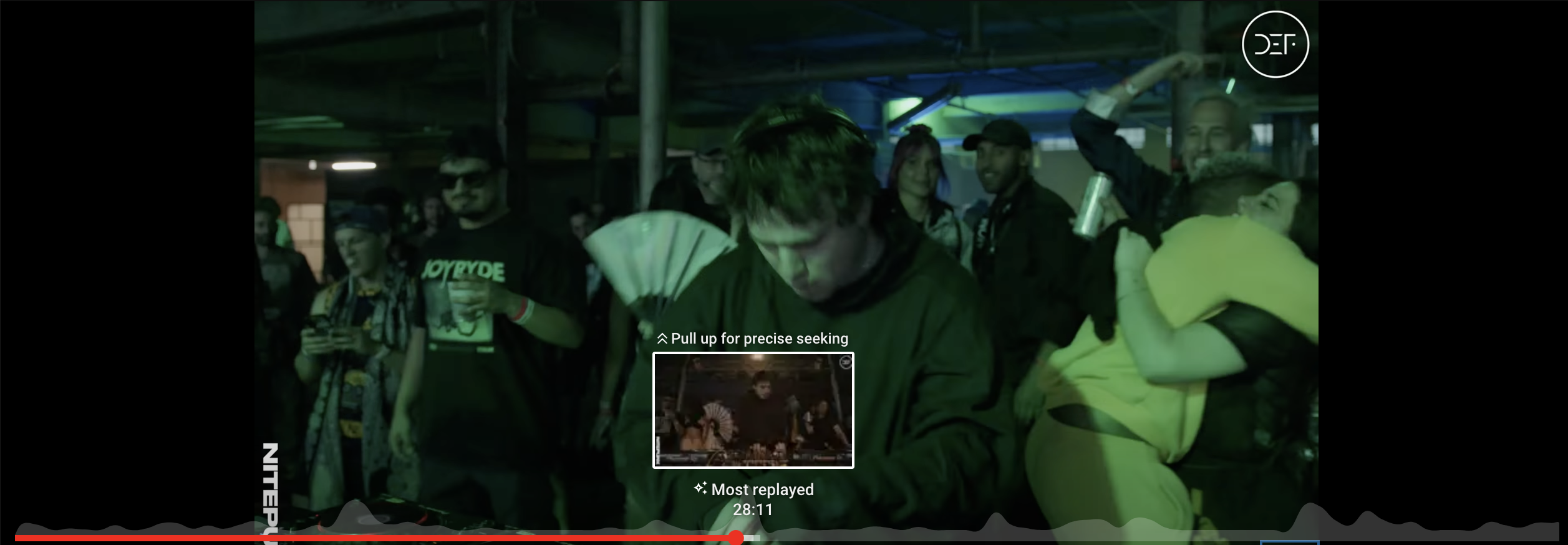
This alternative way of visually navigating the same audio content is interesting to me because it seems more about herding the user towards what’s most popular rather than merely representing the content in a different modality (aural –> visual). Soundcloud’s waveform fastens a navigational tool out of an audio artifact – loudness. YouTube’s waveform transmogrifies peer pressure into voluptuous humps along the progress bar, each suggesting that I click there for a good time.
How does this change my relationship to the mix as a consumer? I suppose that if I had first encountered this mix on YouTube, I’d want to skip ahead to the most popular moment to assess for myself whether or not its supposed hypest moment is truly sicknasty before committing to leaving this on in a non-selected tab on my browser. Would that spoil its biggest, bestest, most surprising moment? Maybe? On the other hand, I think it’s a sort of courtesy to me as a user, offering me a point to jump to if I want to see what all the fuss is about. It’s there if I want it; it can be ignored if I don’t care.
The “most replayed” waveform backfires for certain types of content, however.
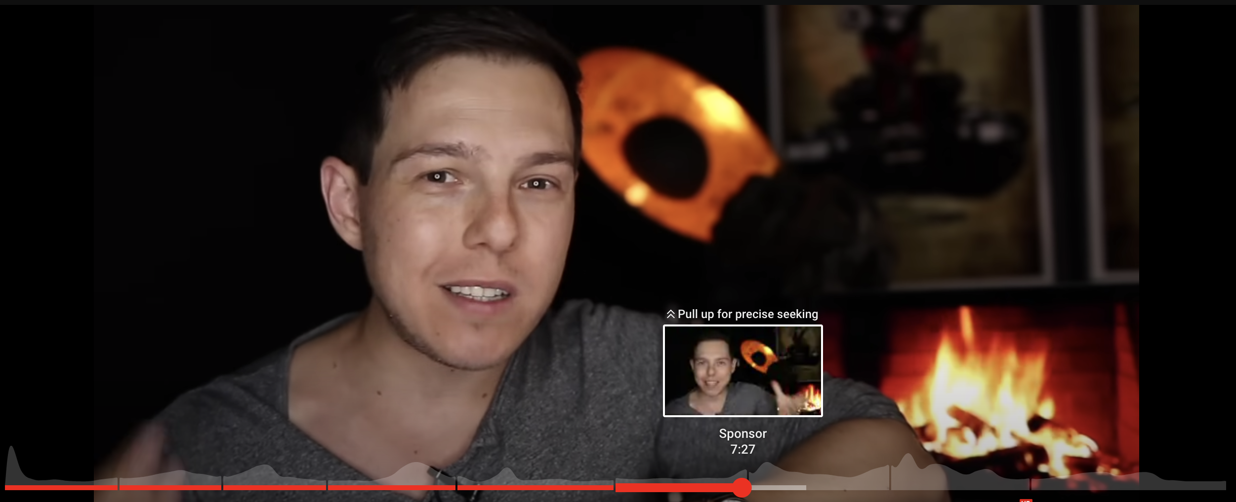
Left unattended, a YouTube video’s waveform can oftentimes devolve into a mere signpost for where a sponsored advertisement read ends. In those cases, the highest point on the navigational landscape is no longer a visual representation of “peak-content” but rather a subversive trail of breadcrumbs left unbeknownst by users with the same aversion to ads as you.
The good thing is that there’s a fix for this: associating descriptive metadata with certain points along the duration of the video is in the hands of YouTube creators. Once it becomes obvious to viewers where the sponsored ad reads start and end during a video, they’ll be less likely to assume that peaks on the wavelength represent the exit points from ad reads – that is to say, the annoying points of the video. In this way, YouTube creators can fortify the “accuracy” of these wavelengths – accuracy according to their intended shape of representing the most replayed points of the video – and thus also fortify the usefulness of the wavelengths as navigational tools for their viewers.
Given the nature of YouTube as a video platform and Soundcloud as an audio platform, their respective user interface representations of audio-driven content are completely sensible. For music, I prefer Soundcloud’s approach, though I think I feel that way due to the time-stamped comments rather than the shape of the waveform navigation. YouTube’s approach, while it may have a multiplying effect (for better or worse) in funneling users toward a few narrow points along the duration of a piece of content, lends itself to usability in the sense that it gives users an easy way to get to “the” point of a video.
What I’m really trying to say here is that you should really listen to this mix:
